NO
EXCUSES
From a commission for an academy to a complete sports brand system. The story of how one project changed direction and became something more.
Where it
all started
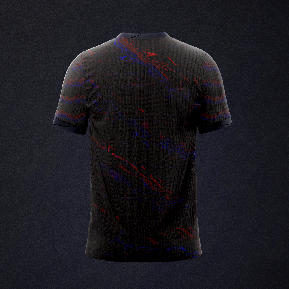
A coach from the AP Cassubian football academy came in with an idea to create his own clothing brand. The goal was to design a complete match kit consisting of a game jersey, a casual jersey, and shorts.
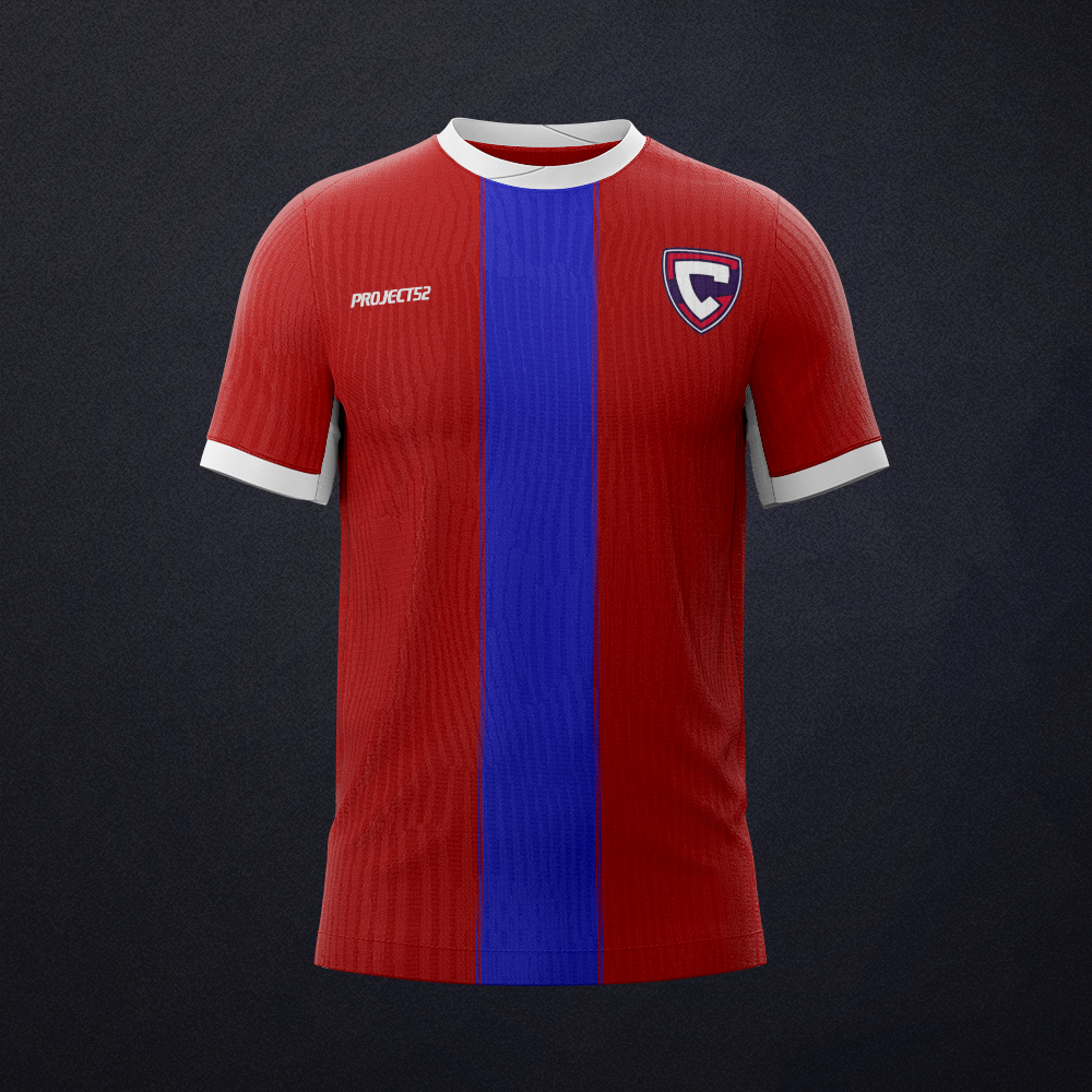
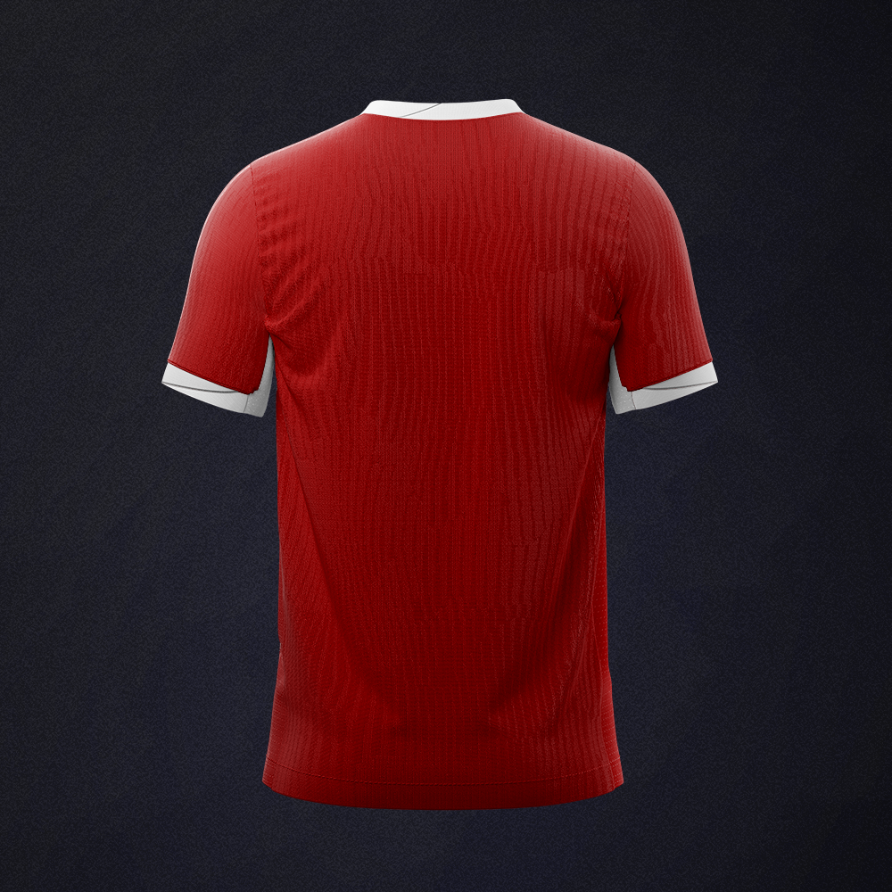
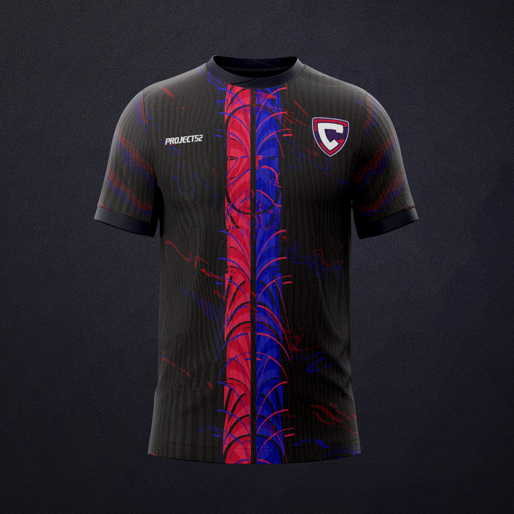
The first version was created under the Project52 brand, using the academy's colors. During the process, the concept shifted - instead of working under the existing logo, the decision was made to build a completely new, independent brand.
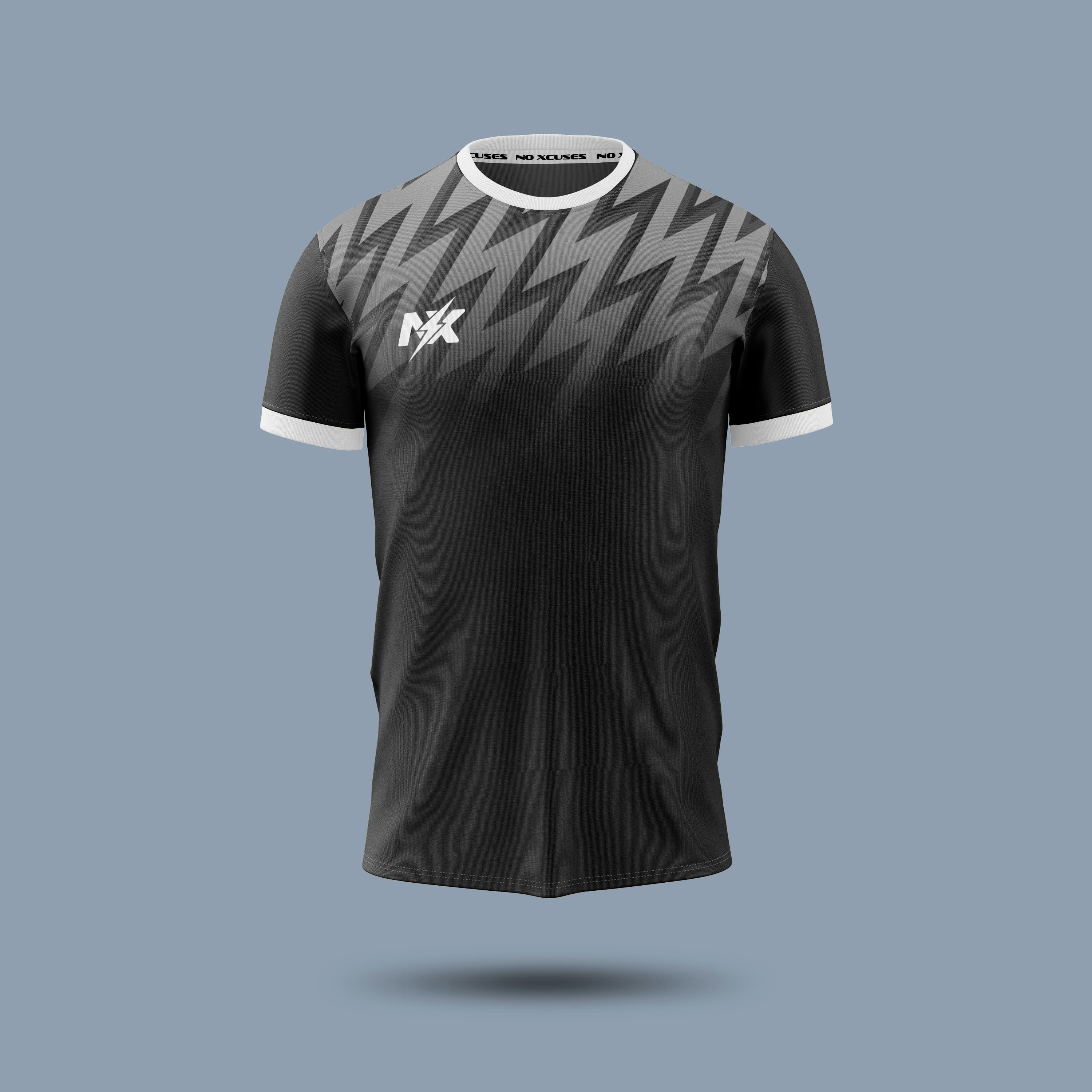
The result was NO EXCUSES - a new visual identity, color palette, logo, and graphic system for sportswear.
NO EXCUSES
How the
logo was made
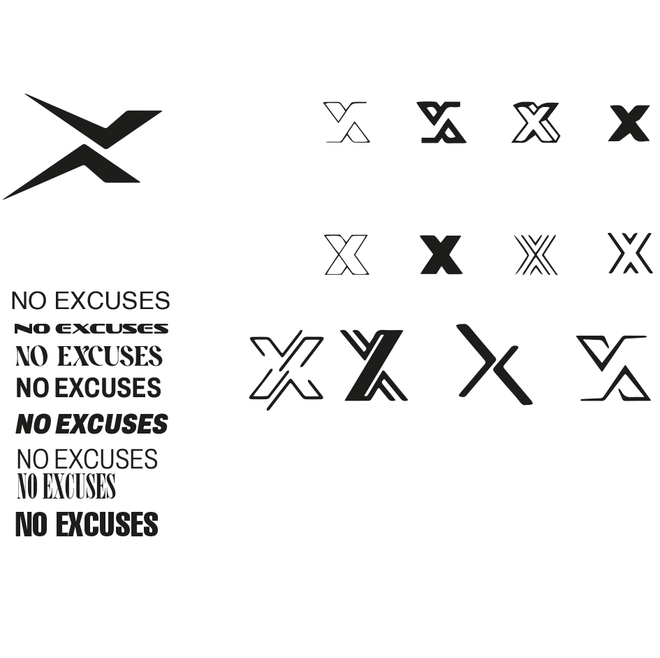
Exploration - X variants, typography, directions
The starting point was the letter X - short for "excuses". Dozens of variants were tested: outlined, filled, with serifs, geometric, interlocking.
Typography for "NO EXCUSES" was explored in parallel - from serif to condensed bold, from subtle to aggressive typefaces.
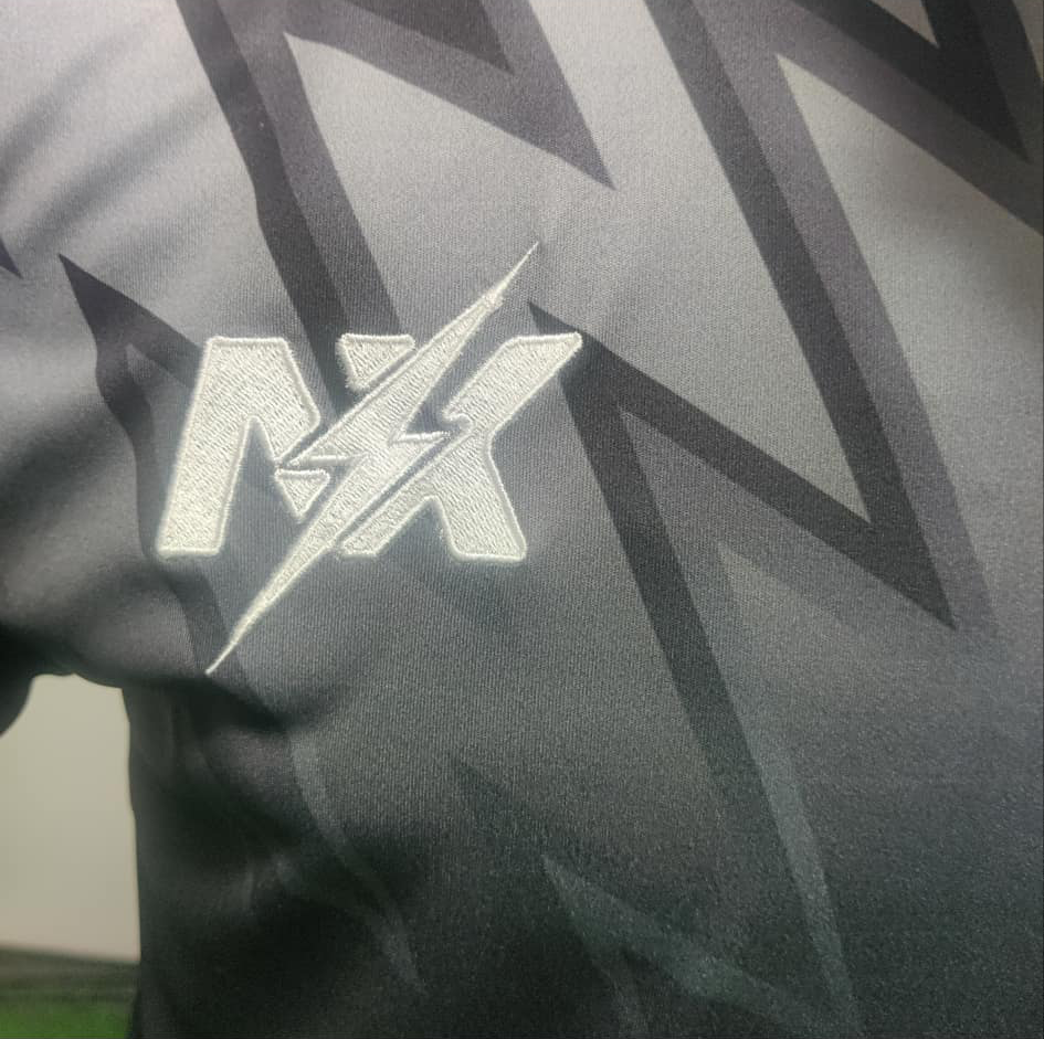
The final N/X logo combines the letters N and X cut through by a lightning bolt. Energy, speed, and the character of a sports brand aimed at young athletes.
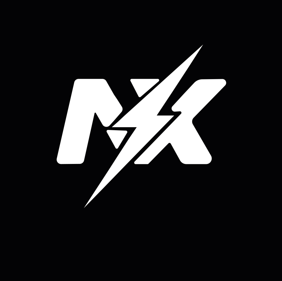
Final logo version - embroidered on the kit
Brand language
Full grayscale. Moving away from club colors - here the pattern and logo define the kit, not the color. The monochromatic palette gives it a premium feel.
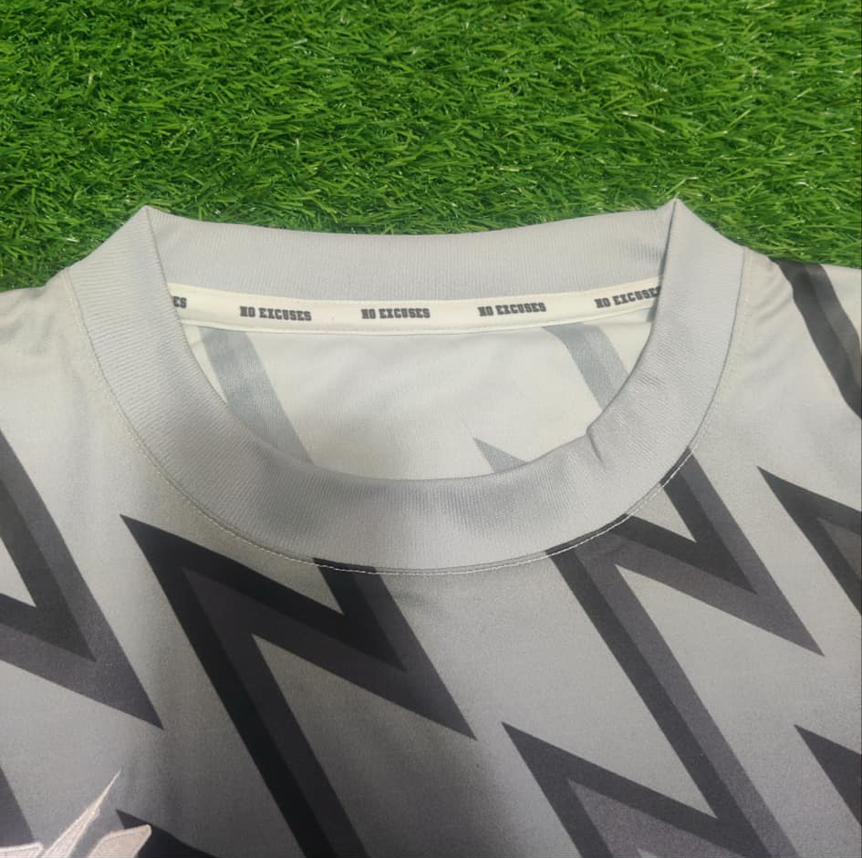
Sofachrome is a font with a sporty, angular character. Used on the collar tape, labels, and all brand communications.
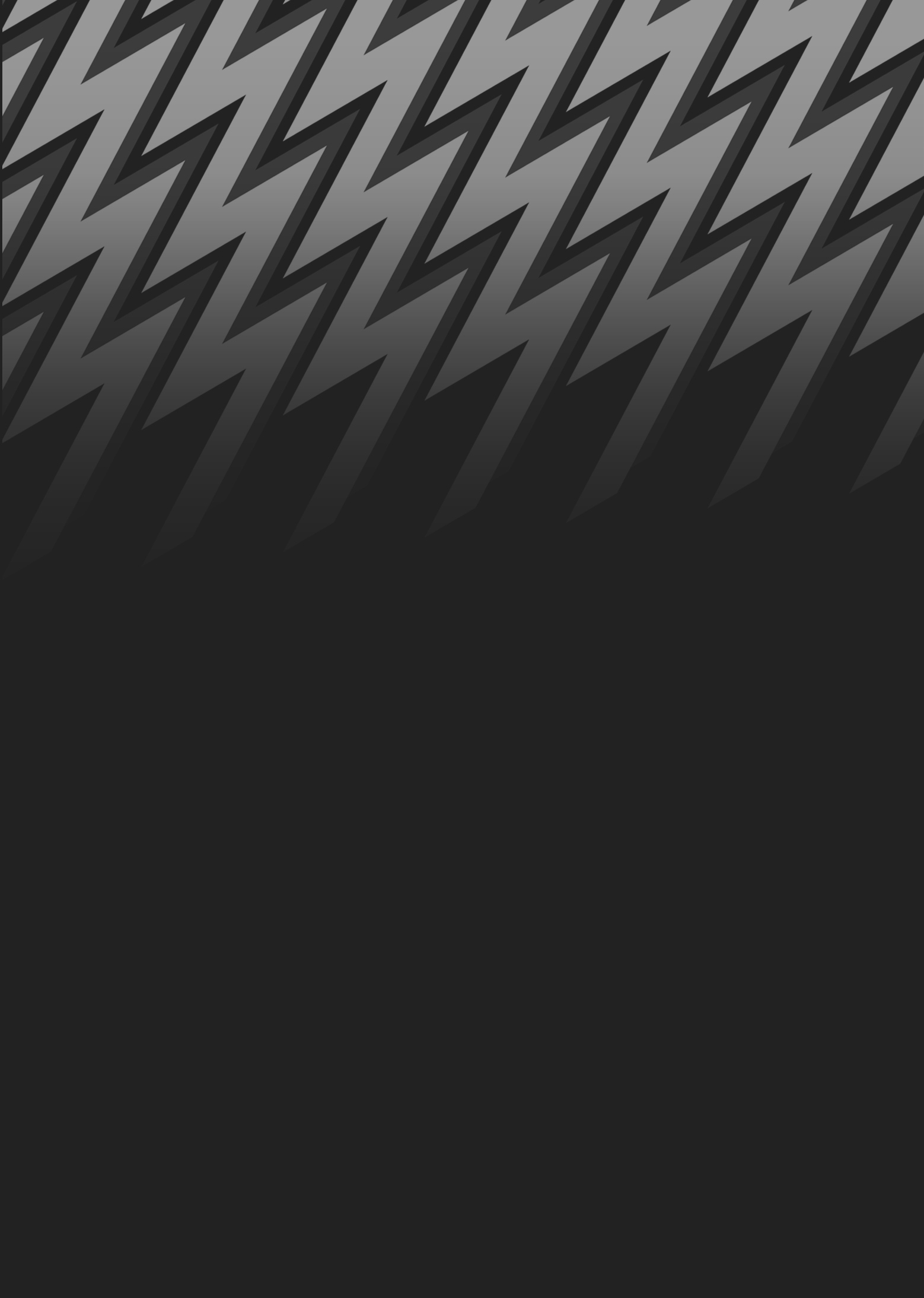
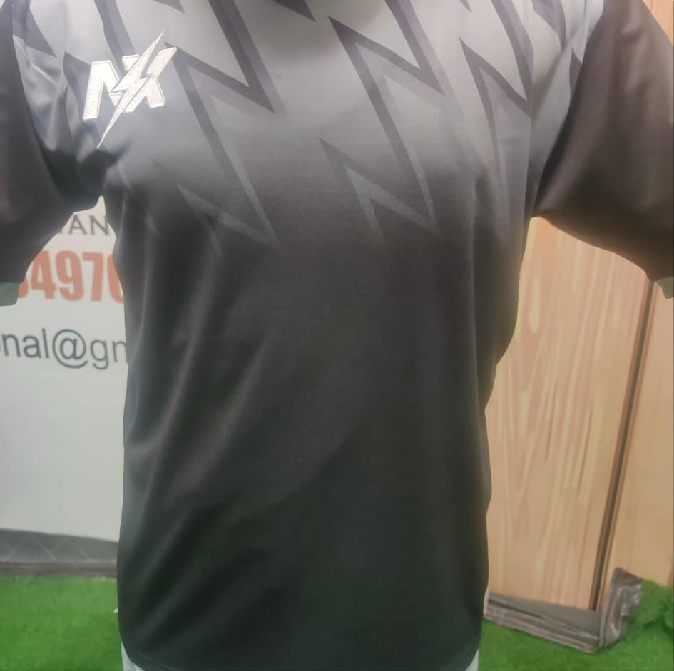
Lightning bolts as the main motif - a geometric echo of the X in the logo. Pattern sublimated onto the fabric, with a top-to-bottom gradient creating depth and dynamics. The same pattern appears on both kit variants.
From screen
to the pitch
The design went to a garment factory abroad. Pattern sublimated onto the fabric, N/X logo embroidered on the chest, personalized "NO EXCUSES" collar tape. A physical product that exists beyond the screen.
What this project
taught me
The system matters more than any single element
A logo is just one piece of the puzzle. Only when combined with colors, patterns, and details does it create a cohesive brand identity. This project showed me that a brand works best when every element supports the others.
Changing direction is part of the process
The shift from Project52 to NO EXCUSES was a decision about ownership and identity. Sometimes the best project is the one that changes its own direction along the way.
Designing for production
A mockup in Photoshop is one thing. Seeing the N/X embroidery on real fabric is another level entirely. Production tests the design mercilessly and teaches you to respect the details.